Introduction
Stormsurf significantly upgraded all our Wave Models in early 2009 and the Weather Model are poised for release shortly. We
built these tools with the goal of providing full global coverage of
the ocean-atmosphere interface from several perspectives ranging from
global to local. This has been an evolutionary process driven by
a combination of our developing skills at using the tools to build the
images, and NOAA's steady march forward at improving the underlying
mathematics/physics of models themselves all fueled by the dropping
price of computer memory and steep increase in CPU power. The result
has been nothing but fabulous for the end user. With these
upgrades nearterm performance of the models are much improved and
zoomed-in inspection of local conditions becomes a reality.
The
Weather Models provide animated forecast imagery for the atmosphere
while the Wave Models focus on the oceans surface. It is the
interaction of the atmosphere on the ocean in the form of wind that
generates waves, so the focus of the Weather Models is naturally
surface wind. Likewise the result of that wind blowing on the oceans
surface is chop, which can build into windwaves, sometimes
reaching monstrous proportions if the wind is strong enough,
lasts long enough and covers a large enough area. Those windwaves
eventually migrate away from the fetch area that created them, and as
the raw components dissipate, swell emerges. It is swell that make the
best surf, and is what is most sough after by surfers.
The
models also depict these natural processes at a deeper level with the
entire wind-to-sea-to-wave lifecycle supported. Wind is generated by
differences in surface pressure, with air flowing from areas of higher
pressure towards regions of lower pressure in an attempt to create
equilibrium. As wind moves over the oceans surface it produces seas or
swell, which in-turn have energy. That energy is quantified by it's
period (which increases as the swells propagate away from their
source). As swells move into shallow waters they begin to break
creating surf, and those waves size can be predicted based on the
interaction of the swell/sea size and period. More details concerning
these processes can be found in the tutorials (see navigation bar
above) with a rudimentary understanding of that information helpful if
you want to dive into the deep end.
Our models are broken down into 4 geographic categories:
- Global (whole planet),
- Hemispheric (e.g. North Pacific, South Atlantic, North Atlantic, etc)
- Regional (e.g. Northeast Pacific, East Indian Ocean, Tasman Sea, etc)
- Locals (Margaret River, Hawaii, South California, Central Florida, West South Africa etc).
So depending on your need, the data is available at the macro or micro level.
This
is and will remain a work in progress with more detailed Wave
Model imagery constantly being developed. How much actually makes
it the public webserver will depend mostly on whether the existing
content is used. Each set of images requires computer CPU cycles and
bandwidth, which in turn costs money. So we focus on images that will
benefit a wide audience first and are working our way down to more
targeted detailed charts last.
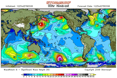
Global significant Wave Height using version 3.0 of the Wavewatch wavemodel and 3D topographic relief landmasses.
General Features
Presentation Improvements
We used government provided model graphics for years, and built surf
forecasts too. Like most of you, we've noted some very useful
features and some that we wished we could improve. So our
graphics represent what we consider the best of both worlds
packaged in a way to enable both the beginner and professional
forecaster to get to important data fast. Some of those improvements
include: 1) Identifying seas up to the 54 ft, 2) Provide seas height
resolution to 1 ft and, 3) provide user friendly color scaling that
correlates wind speed to seas height to swell period (wave models).
Take a look at the filtered output and notice how 35 kt winds produce
17 ft seas which in turn produce a 13 sec period swell. Of course there
are many variables in this mix, but the general pattern is used across
the board.
Each
image was custom proportioned to fit the specific area being depicted.
We used fixed latitude and longitude proportioning rather than
stretching or shrinking images to fit a fixed footprint. So rather than
saying "all images shall be 600 X 450 pixels" and then trying to morph
the image for a region into that box, we instead manually proportioned
each individual image. This results in some images having some
dead-space around the edges and supporting a wide variety of image
dimensions, but from a purist standpoint provides a geographically
symmetrical chart and a higher degree of image integrity.
Control
One thing we detest is animations where the user has no real control.
Without the ability to interrupt playback of an animation to examine
the details of one frame in the sequence, the sequence becomes almost
useless, the equivalent of a commercial (eye catching images with no
useful purpose). So we built our own custom batch programs to wrap all
the images in a Macromedia Flash shell, enabling the user to stop the
animation anywhere in it's playback sequence, step forward frame at a
time to examine some detail, or even reverse the animation one frame at
a time. All with just a click or two of your mouse. The Control Panel
for each animation is always positioned in the images upper left hand
corner. Of course you have to install the Flash Player, but it is a
free, simple and secure download from Adobe's (formally Macromedia) web
site and is used extensively throughout the web.
Download Speed
In addition we have tried to balance providing a large image size
(again to allow detailed examination of the product) with minimized
download time. Without going into the details, we can provide a native
resolution 700 X 500 pixel 7.5 day animation in 6 hour increments with
a total download size averaging about 1.5 meg. And any of the filtered
images are much smaller. This is still a challenge if you're using
dial-up, but with any form a broadband this is instantaneous
gratification.
Wave Model Features
Which Wave Model?
We use the NOAA Wavewatch III wave model, specifically the new
version 3.0, which is now running in-parallel with older version
2.22 (more on this later). FNMOC also runs a customized version of
NOAA's code, but the underlying equations are the same. There are no
other reliable global and regional models currently available in
the public domain. The overriding differentiator between NOAA and
FNMOC is the source of wind data used to drive the wave model (that's
right, wave models use atmospheric models as their input source). NOAA
used to use the GDAS wind model (in version 2.22), and has now upgraded
to the hi-resolution GFS wind model where FNMOC uses the NOGAPS.
NOAA runs the GFS hi-res model 4 times daily versus 2. It was
a personal preference, but we chose to go with the publicly funded and
maintained solution rather than a military funded source and liked the
ability to get updates more frequently.
Resolutions
Version 2.22 of the NOAA Wavemodel suite included one global model
with a 1 X 1.25 degree resolution (one data point roughly every 60 X 75
nmiles on the equator) plus multiple regional models with a 0.25 X 0.25
degree resolution (15 X 15 nmiles). We used to download all of them and
use the highest resolution model available to fit whatever region we're
depicting. but with the advent of WW3 version 3.0, a whole new mapping
scheme was enacted. The global model is now available at a
resolution of 0.5 X 0.5 degrees (corresponding to the 0.5 X0.5 degree
GFS hi-res wind model). In addition there are 3 embedded models, one
for US West Coast/Canada waters at 0.166667 X
0.166667 degrees, a second at the same resolution for the US East
Coast, Gulf of Mexico and much of the Carribean, and a third for the
East Pacific focused on Hawaii and select other islands. That places a
data point in 10 nmile squares, or 2.5 times better the resolution
than the best local models in the old 2.22 scheme. These
sub-models mask out all but nearshore waters. In addition, there
are 2 super hi-res models available for the US West and East coast at a
resolution of 0.066667 X 0.066667 degrees. (4 nmile squares) or
14 time higher than the best of the 2.22 model. Most
impressive. And what's even better is the number of variables
available for each product. Of main interest for surfers, it now
provides primary and secondary swell size and windwave size. So
tracking an individual swell by both pure swell height and period as it traverses great expanses
of the ocean is now possible. More on the pluses and negatives of
this in a minute.
Here are the coverage areas of the 3 medium resolution nested grib models in the new Wavewatch 3 models, Atlantic, East Pacific and West Coast. Notice that only data is provided for a subset of the grib.
The output from NOAA's supercomputer is not the series of pretty images
you see, but is instead is a thing called a grib file. It is basically
a binary database containing all the information for every data point
on the planets surface (or within the predefined region). Those gribs
are then downloaded by local providers like Stormsurf who ingest them
into tools to create the graphical images we typically associate with
'models'. The inference is that though many sites claim to have their
own custom wave models, in most cases they are only producing a custom
graphic from NOAAs freely available gribs. We are doing nothing
different here. But what we are doing is presenting the data in a
format that is truly useful for both the novice and the professional
surf forecaster rather than just making a pretty image with no real
forecast utility (a common practice in an attempt to 'dumb down' the
data for the masses).
Missing Data
The wave models in their native form have large gaps of missing data
near the coastlines. There is often literally no data presented within
3-10 nmiles of many coastlines. This is a result of using square grid
boxes and then superimposing them on a coast that is anything but a
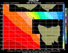
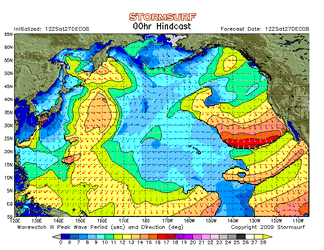
straight line. Here's 2 examples of the problem from version 2.22 of the Wavewatch 3 global and Eastern North Pacific model:
The black areas indicate where no data is presented in the source grib. This typically occurs at the land-sea interface.
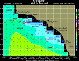
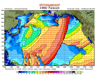
Now, with the advent of version 3.0 of the model with higher resolutions, notice the improvement:
Notice the amount of undefined area is much smaller and more valid data is closer to the coast. The image at left is from the global model (0.5 degree res) and the image at right is from the west coast local model (0.16667 deg resolution). Also notice the improvement in land masses with the new 3D shaded topography.
So
a certain amount of estimation and projection is used to fill in the
missing data, especially on the Local Wave Models, but it is much
improved. To the greatest
extent possible we have used every trick and technique available to
make the images as accurate as possible. Still, the combination of
having to use the global (low res) grib to start with then zooming
way-in to view some remote island chain can result in
inacurracies, but nowhere near as comical as it used to be.
This brings us to the next big enhancement in the models. Previously many tiny
islands (e.g. the South Pacific) were not
depicted at all in the presentation on Stormsurf, and the swell
shadowing caused by them is not
accounted for in the model. We published the results even though
in a few instances they were a little bit shaky because in those remote
corners of the world "some data is better than nothing". But now,
we've found a way to overlay hi-resolution topographic 3D shaded
relief images with one pixel accuracy to all land masses. Using
the GSHHS database which provides high resolution coastline and lake
boundaries, mixed with high resolution satellite
confirmed elevation data, Stormsurf has developed a proprietary
technology to provide a much more life-like look to the images. Note:
This is not Google Earth, but a wholly different and unique technique
which accomplishes a similar result. And this same
technology has been incorporated into version 3.0 of the wave
model to identify bathymetry and land masks, dramatically
improving the physics of the wave model in regard to swell shadows,
shallow water obstructions and bathymetric affects on waves in the
surf zone. The combination of these improvements are apparent when
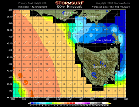
inspecting the effect of the Tahitian Islands on southern hemi swell
(see below). Notice that even the reefs and atolls north of
Tahiti are apparent.
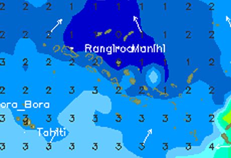 |
In this image note the atolls in the center of the image. You can actually see the outer reefs and interior lagoons associated with many of them. Swell shadowing is accounted for in the models bathymetry too.
Surf Height
Contrary to popular belief, 'sea height' (a.k.a 'significant wave
height') does not equate to surf height.
You cannot look at the significant wave height for a point near
your beach and
determine what the surf height will be. That is because it's the
interaction of 'swell' and 'period' that determine surf height.
Normally there are multiple swell and wind waves interacting at any
given point, all of which in-combination are 'added' together to
produce the 'worst case' number known as significant wave height.
It is a measure useful for boaters to know what to expect if all
those elements were to converge at the same time and place, and your
boat happened to be in that location. But typically only 1 swell, the
dominant swell, makes the surf you ride and it is normally
something far less than the worst significant wave height.
In
version 2.22 and earlier of the Wavewatch wave model, swell
height was not provided as a variable in the WW3 grib. We
had to use
some trickery to estimate surf height using the available resources.
That approach tested out well for most
situations and a good number of our users have developed skill at
using the Surf Height charts to estimate actual surf height for their
favorable breaks. But with the advent of version 3.0, primary swell
height and period, and secondary swell height and period are now
included as chartable data elements. As such, we added them into all
our products. But the results are not as cut-and-dry as
one might expect.
The
problem many folks are having with the new model is that
there is no swell data near a fetch area. When you are at a
location where the wind is just starting to produce wind driven waves
(windwave), or something even less refined than that,
the Significant Sea Height chart does well at approximating
the height there. It provide a nice continuous picture of
conditions at the oceans surface. But near the core of a fetch,
swell height values default to near 0 (since there is no 'swell',
only wind driven seas). Hence you see either choppy hints of
something or missing data near the core of storms. And if the
fetch is near the coast, the same problem occurs.
If
you take a minute to think about this, it makes perfect sense.
Swell only develops once windwaves radiate out away from the
fetch that makes them. The choppy and raw elements of the
windwaves dissipate as the wind energy that was transfered to the ocean
surface becomes organized mostly under the surface into mid-to
longer period swell energy, which in turn forms wave trains, and
eventually sets.
But
to actually see this happening in real-time via a model is most
disconcerting. If you know a storm just formed 1000 nmiles
off your coast, and are looking at the Significant Sea Height charts,
one sees 30 ft seas. But if you look at the
swell height chart you see almost nothing, and say "What's
going on here? This thing must be broken". But it's
our perception of reality that is broken, not the model.
There is no
swell because the windwaves have not yet moved away from the fetch
area and started their natural evolution from windwave into swell.
This takes some time to get use to, but after you sleep on it a
night or two, you realize it makes perfect sense.
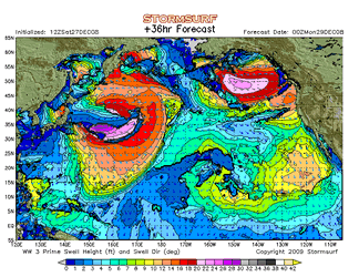
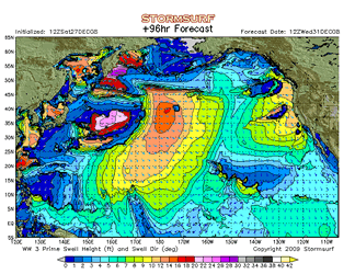
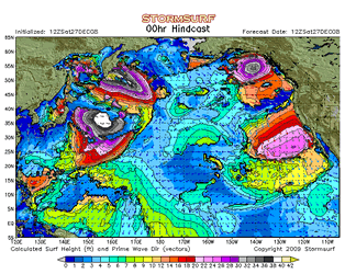
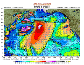
| Significant Sea Height View |
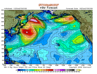 |
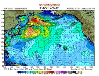 |
In the above images notice 'seas' of near 30 ft pushing off Japan (left) and 96 hours they have all but dissappeared (right) as they propegate east to the dateline.
| Primary Swell View |
 |
 |
In these image notice the almost complete absence of 'swell' in the fetch off Japan (left). This is because there is no swell, only wind wave. But 96 hours later notice how that swell has evolved over time and distance organizing into a real swell front, much like what we are used to seeing in swell period images.
| Swell Period View |
 |
 |
Notice how the period is minimal off Japan as the fetch is just starting to get traction on the oceans surface, at 13 secs (left). But as the swell propagates east the period expands (right). Also notice that most size is not on the leading edge of the swell where the period is the longest (reference Primary Swell image above) but it actually sits back in the pack a bit.
| Wave Size View |
 |
 |
Finally we integrate swell height and period to calculate surf size. We pick up limited windwave and swell energy (left) but surf size is still undefined in much of the fetch area (as one would expect). But 96 hrs later we have a much better view of the surf size as swell has evolved and the period has sorted itself out. A defined swell front is present and we can inspect it from a variety of perspectives. No doubt this is not perfect, but it truly is state of the art.
To mitigate this (and at no small amount of effort), we attempt to interlace windwave values if no swell was
present, but it still does not completely eliminate the fractured nature of
some of the images where strong winds are occurring. Hence some readers have
complained about the new images not being as 'clean' as the old ones. Such
complaints are valid.
But
the great benefit of the new approach is that as the raw wind
driven seas start to emerge from the fetch area, one can clearly see
the primary swell developing and radiating out from the fetch, much the
way the swell period charts depict the swell moving out from the
fetch. In fact, the same thing has always occurred with the
period charts. There is no period in the fetch area. Only after the
swell starts moving away from the fetch does the period begin to inch
up.
What
this means is one can now use a the values from the pure
swell period chart and those from the swell height chart for
any given point on the planet, and integrate those values to
compute a real and accurate surf height. Or you can just use
our Wave images which essentially do the same thing. But again, if
the fetch is snuggling up to the coast, you will get dropouts in data
since the swell value essentially falls to 0 near the storms core.
And since there is no 'pure' swell in the fetch itself, Wave height
values often will not be present. If you see this occurring near
your shore, you know the resulting surf will likely be quite raw since
it essentially is 'in the fetch area'. But if you have to have a
number, we've kept the old style global wave charts active, because, as
it turns out, they are exceptionally good at estimating surf height in
these situations.
Unfortunately,
we've kept them only for the global models and not the regional or
local models because the amount of data we're already shuffling around
is quite large (and therefore expensive).
This is state of
the art technology, and it takes some getting used to, but is by far
more accurate than anything previous, and sets us up to build yet
better products in the future.
The
great part about these charts is you can actually watch
the decay process occur as seas radiate out from a fetch area and
transition into swell. Since period is increasing with distance, even
though sea/swell height fades, the total surf height size
does not decay nearly as fast as the seas themselves. A variety of surf
height perspectives (global, hemispheric, regional, local) are provided
for a reason. Since it is physically impractical to provide local
charts for every break on the planet, you can use the other non-local
perspectives to estimate surf height with a high degree of accuracy for
you location if it's not already provided. For instances where swells
travel long distance (e.g. from the southern hemi) and then interact
with larger locally generated windwaves (like off California in the
summer) there remains a bit of an issue. The WW3 has to make a
determination which
swell is the dominant one, the windwave or the ground swell. Sometimes
it picks the windswell,
sometimes the long distance swell, and sometimes is is a patchwork of
both swells passing through each other. The issue becomes especially
pronounced on the local wave models. But ofter you will see the pure
swell appear snuggled up to the coast, while the wind wave is more
dominate only 20 nmiles out. The general rule of thumb when
using the local models is to pay close attention to the swell direction
arrows. They will tell you clearly which of the two swells is
generating the surf height depicted on the charts. Another
option in those instances is to use the Buoy Forecast section
of the site. These charts are much more sensitive and
should clearly indicate the secondary surf height.
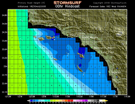
Local Bathymetry
The effects of nearshore bathymetry (within 5 nmiles of the coast) used
to not be included in the local wave models. But they are now. And
as time and budget permits we're going to be building yet closer
zoomed-in local models for select high traffic locations in the US. in
fact, we've already started this project. At a macro level the
Wavewatch III now does an excellent job of
depicting major oceanic bathymetric features. Swell shadows on the
South Pacific Islands are supported like Tahiti as is the Galapagos
Island using the GSHHS coastline database. Still, near shore break to
break bathymetry is not supported. As you look through various regions
keep an eye out for
shadowing, and often you be surprised at what you'll find. Closer to
your break you can assume the surf height depicted on the local charts
is the "average" surf height. Clearly there are breaks that amplify
wave size for long period swells by some factor. Using your experience
you can simply multiply the surf height depicted on the chart by that
factor to get an accurate surf height estimate (normal ranges are
1.0-2.0 times). Conversely some breaks will always be less than the
surf height depicted. The same technique can be used here (0.0 - 0.99
multiplication factor).
Wave Model Highlights
Hemispheric (from the Global Grib)
Global (Lo-Fidelity Mercator):
These charts provided a quick globe-at-a-glance view to what is
forecast over the next 7.5 days. Sea heights are in 2 ft increments but
no directional arrows or wind barbs etc are provided. Contouring (the
thin black lines that separate the colors) are turned off when sea
heights reach 38 ft and are printed only in 4 ft intervals between
24-38 ft. Otherwise the black line would be so densely packed you
couldn't see the actual colors. No longitude/latitude grid provided.
These are not serious forecast charts, just a way to get a quick
overview of the global forecast.
Rotating Globe (Orthographic):
Again, this is not a serious chart, but it is a cool depiction and so
we shrunk one and use it in the header of every page. The time period
resets itself to 00 hrs as the globe rotates over each ocean (Atlantic.
Pacific, Indian).
Orthographic:
These are beautiful images and give one a much better sense of how
waves travel across the oceans following great circle paths without the
distortion associated using a standard flat Mercator projection. No
arrows provided on the Sea Height and Max Swell Period charts because
they just clutter up the image. Using the animation you can view the
travel direction. Arrows are included on the Wind charts since it is
wind that determines a swells heading.
Hi-Fidelity Hemisphere (Mercator):
These are the meat and potatoes of wave models and made to be used for
detailed professional level surf forecasting. They run off the global grib. 2 ft sea and surf height
intervals are provided with arrows throughout. Note that the arrows on many
charts are color and size scaled to sit nicely in the image without
overpowering it. Contours on the period charts start at 10 secs to
minimize buildup of thick black lines on the leading edge of swell
fronts. Note that if seas and surf exceed the limits of the color
scale, contours continue in 2 ft intervals so one can manually
determine actual values. Latitude/longitude grids included.
180 hr Hindcast:
For all Hemispheric locations the 00hr image from each run of the
model for Sea Height is archived
back 180 hours and then Flashed into an animation. This provides a
retrospective view 1 week into the past. This is a great tool for
figuring out where that mysto swell came from. And if you're really
crafty, you can go back a few more days using the Jason-1
Altimetry animations and get the benefit of satellite confirmation to
boot.
Regional
Some of these are built from the much higher resolution regional wave
model gribs supplied by NOAA (see 'Resolutions' above) while some are
from the global grib. Wherever possible, if high resolution data
is available, it is used. Regional Models that use the higher
resolution gribs are denoted with a
'+'. All the same features applied in the Hemispherics are applicable
here.
Filters:
For the Gulf of Mexico and the Eastern US Coast we added a 9 sec period
filter so that all seas 10 ft or higher, periods 9 secs or higher and
winds 20 kt or higher could be identified.
Local
Now you have the ability to zoom into a rather small area to see what the surf will be doing 7.5 days from now.
Intervals:
Surf height is depicted in 1 ft intervals. Colors are separated by
white contours in 1 ft intervals up to 10 ft, then in 2 ft intervals up
to 42 ft while the contour remains at 1 ft intervals beyond 10 ft.
Overlay:
Wind barbs are limited to the Wave/Surf Height charts,
while swell direction or wind direction arrows are overlaid on the
remaining images. In
this way you can determine surf height, swell direction and wind speed
and direction from one chart. Pretty cool. Of course you have to know
how to read a wind barb (look in the tutorials). Wind barbs are drawn
at the highest density possible while still making the charts readable.
Swell Direction arrows are less critical and are often filtered to a
lower density.
Gribs and Grids:
The actual values supplied by the model, be it surf height, swell
height, wind speed etc are actually overlaid onto the chart.
Though looking at colors is nice, we find it especially
informative to be able to drill down to a particular grib box and
inspect the actual value for that location. Values are rounded to the
nearest integer. with version 3.0, for Surf Height charts, we now
indicate whether the surf height is provided mainly from pure swell or
windwave. If it's swell, the grib box value is in black. If
windwave, it's in red.
Mountains, Cities, Roads, Lakes:
Major cities, highways and lakes are overlaid to provide perspective.
And of course our new 3D shaded topographic relief landmasses are
utilized to their fullest.
Point Forecasts (Graphs)
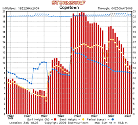
With this release of the Stormsurf waves models (2009) we now have the ability to pull a forecast off a single point from the grib. For example, say you want a forecast for Cape Town, South Africa. There are no virtual buoys there, and no other source to get zoomed-in local data short of building a forecast chart for that location. But with a grib point forecast we can extract all the pertinent information, like primary swell height, swell period, estimated surf height, swell direction plus wind speed and direction every 3 hours for a full 7.5 day range, graphed out on two separate charts This makes for a great way to get a quick overview of what surf conditions will be like.
|
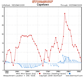 |
Capetown Surf and Wind Forecast - In the image at left surf is the red bars, swell height is gold boxes and Swell period (using the scale at right) is the blue dots. Swell direction is depicted in the arrows at top. When there is no swell, windwave is substituted and the arrows turn from blue to black. Winds speed is depicted in the image at right, with wind speed in red and wind direction in the blue arrows. All times are in GMT/UTC.
Text Forecasts
Additionally we provide text forecasts for all the same locations serviced by the graphs above. There are in essence the same as the graphs, but just provided as a text readout rather than a picture.
Weather Model Features
Which Weather Model?
There are numerous weather models currently available, all with
specific coverage areas and specialized applications. From a global
perspective the GFS (Global Forecast System - formally the AVN) is the
model of choice and couples best with version 3.0 the Wavewatch III
(WW3) wave
model. That is, the weather systems depicted by the GFS model
are assimilated into the WW3 to drive it's output. If you
spend any time jumping from atmospheric to wave models, you'll notice
a 100% correlation now between the weather systems depicted in the
weather models and the swell that show up on the wave models (or
visa versa). This was not always the case in version 2.22 of the
Wavewatch WAM.
Resolution
The NOAA GFS model is a single global model with a 1.0 X 1.0 degree
resolution (one data point every 60 X 60 nmiles on the equator), or the
hi-res GFS which has a 0.5 X 0.5 degree resolution (same
as the WW3). The 1.0 X1.0 degree res GFS works fine when building
marco level charts,
but as you zoom-in to determine regional wind speed and
directions, things can start to fall apart or the fidelity is
not high enough to produce a meaningful forecast. This holds true
especially concerning tropical systems. Hence the need for higher
resolution (smaller grib squares). Fortunately the hi res-GFS with it's
0.5 X 0.5 degree resolution (30 X 30
nmiles) works better. So we're processing the 1 degree GFS for the
Global and Hemispheric views and we're using the Hi
Resolution
version for Regional views.
And
for local wind and precipitation forecasts in and near the United
States, we use the NAM (0.111 X 0.113 degree resolution). This is
actually nested in the hi-resolution GFS model and provide not only
super fine degree views of winds and precipitation, but also
factors in elevation and topography. This greatly enhances it's
accuracy for forecasting wind in canyons and near mountain passes and
also reflects enhanced precipitation over sharply increasing
elevations.
Levels/Variables
Our models have been built to examine the air-ocean interface. There
are hundreds of variables we could display (temperature, snow
cover, humidity etc..) but from a wave generation and wave riding
perspective,
there is only one thing that really matters: Wind Speed and Direction.
Secondary to that is surface pressure (since it is the stuff that
generates the wind). And just for fun we threw in 250 mb winds and
height (jetstream stuff) since that has a major influence on how storms
(and therefore winds) develop. And lately we've included precipitation,
because everyone wants to know when it will rain. Of course there's
always the money
issue, so we tried to provide the important stuff while containing
cost.
Weather Model Highlights
Hemispheric
Global (Lo-Fidelity Mercator):
These charts provided a quick globe-at-a-glance view to what is
forecast over the next 7.5 days at the surface and aloft. Isobars are
in 4 millibar increments but not tagged with actual values. Red isobars
represent low pressure (i.e. 1010 mbs or less) while blue isobars are
high pressure (greater than 1010 mbs). Wind speeds are in 5 kt
increments starting at 15 kts (no swell generation potential below 15
kts) Contours are only supplied from 20-45 kts, otherwise the colors
would get lost in black lines. No arrows or barbs to define wind
direction, though it can easily be inferred. Again these are good
overview charts, but not for detailed forecasting use.
Hi-Fidelity Hemisphere (North Pacific, South Atlantic etc):
These are a good starting place to get some detail on the macro level
scenario. Isobars are in 4 millibar increments with tagged values.
Contours are supplied for all wind speeds. Arrows are used to indicate
wind direction. All other attributes are the same.
Zoomed Hemispherics (Northeast Pacific, Tropics, etc):
Now we're getting into the good stuff. These images are not just
cropped versions of the above images, but are custom built from the
ground floor up. Isobars are in 2 millibar increments with tagged
values. Wind barbs replace arrows and are placed more dense to identify
local wind conditions at locations where swell is hitting. These charts
therefore due double-duty, Examining the internals of a particular
fetch and to forecast local winds. Used in conjunction with the great
circle charts (see navigation bar above) one can determine if the fetch
is blowing up a great circle path to your beach.
180 hr Hindcast:
Like some of the Wave Models above, the 00hr image for all
hemispheric regions back 180 hours are Flashed into an animation.
Regional
Images for a select few regional locations
are provided using the hi-resolution GFS model. These are great because a level of
detail about wind fields are visible that can not be found using the
normal GFS. This is especially true for tropical systems. As such the
wind scale is expanded up to 135 kts (155 mph - Cat 5 hurricane) and
was most instructive tracking Hurricane Katrina - 8/05). Otherwise they
are the same as the Zoomed Hemispherics except with higher wind barb
density. These are our main source for forecasting local wind
conditions over relatively small areas.
Local
Images
for a select locations
in and near the United States are provided using the
NAM model. These really zoom in to identify local winds conditions
for a small area and are displayed in 3 hrs increments (versus 6 hr
increments for everything else). But because of that, they only
go out 84 hrs (and that's an upgrade from the 60 hrs they used to go
out back in 2008). If you need an accurate local wind forecast, this is
the absolute best source.
General Comments
Time Zones and Processing:
The time on the models is in Universal time (UTC), or the time at the
Greenwich Meridian (England) also know as GMT, or simply 'Z' for short.
It is the international standard used by all meteorological
organizations. The models assimilate all the data that defines the
current state of the atmosphere at the time they are run. For example
let's say were are working on the 12z run of the models. Current
readings from satellite, weather stations and a host of other sources
are compiled at or near 12Z. That data is then fed into the super
computers at NOAA and the models start crunching that data. It takes a
few hours to calculate the 'forecast' conditions for the atmosphere out
7 days using those current readings as the starting place. Then the
output from the weather models are run into the wave model computer
simulation which takes another couple hours to compute the current and
forecast state of the ocean. Then all that output is made available to
Stormsurf, who then spends another couple of hours generating the user
friendly images we all view on this site. The short of it is that the
actual images aren't available for viewing until about 8 hours after
12Z. So the 00hr image (and all the rest of the forecast images) from
the 12z run of the model actually become available for viewing by about
20Z.
On
top of that one needs to consider local times zones. If for example you
lived in Sydney, Australia, they are 10 hours ahead of GMT/UTC or Z. So
0Z Monday GMT is really 10 AM Monday in Sydney Australia and 12Z Monday
would be 10 PM Monday in Sydney. So for the time stated on the charts,
just add 10 hours to calibrate for that area. From the perspective of
one living in Sydney, the picture of the environment at 12Z Sunday
(which is 10 PM Sunday Sydney time) is normally available for viewing
at about 20Z which would be is 6 AM Monday. Everyone experiences the
same 8 hours delay. The models are not real-time. We have included a
time zone calculator embedded in the links on all model pages down the
left hand margin. Here an external link if you need
more help in time zone conversion: (http://www.worldtimezone.com/).